
For minimalistic interior painting and to open up your rooms space, use pale, pastel colours – especially whites, beiges and creams. All-one-colour interiors are both extremely fashionable and easy to live with. Pure white will require 1-2 more coats than an off white will, to ensure the paint covers well.
In general two coats of paint are needed to give a flat even finish. If the wall is essentially undamaged so it doesn’t need filling, and the exact same colour the wall was before is chosen, one coat may be sufficient, but two is better.
Featuring a Colour on One Wall


Feature walls make the best use of deep colours while the room’s other walls are painted in the neutral range. Metallic or suede texture paints can create an attractive and dynamic effect on a feature wall in a room.
Too much strong colour can feel overpowering to some. It may close in a room making it appear smaller. Dark colours are rarely recommended for small rooms under 3m squared.
A feature wall can be a small or large wall, and is bold and beautiful.
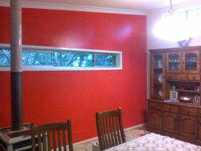
For people who like to use bold colours in dark shades, deep base paints may be required, on these feature walls.
Deep base paints need 1-2 more coats than a normal base. This red feature wall needed four coats.
Acrylic Paint Finishes for Interior Painting
Timber, to retain its natural grain and colour uses a range of finishes. Generally the raw wood is stained, to even out the shades of the timber. Different tints of stain can make pine appear like natural cedar or mahogony. Two coats of a transparent finish, such as polyurethane, protects the wood and its stain. It’s gloss, will bring up the grain, just as shellac or beeswax do for furniture.
In general both walls and ceilings are painted with acrylic paints having a flat or matte finish. Kitchens and bathrooms are often painted in a satin or semi gloss finish, to aid the cleaning of surfaces that regularly encounter steam.
High gloss, semi gloss, and satin are used to paint doors, architraves and window frames, with gloss being the more common finish. Doors and skirtings often need to be wet cleaned of grease marks and build ups of dust. Acrylic paint is most often used for all interior walls and woodwork.

Modern acrylic gloss paints are very hardy with a good smooth finish that is very similar to the no-brushstroke, high gloss finish of oil based enamel paint. The original acrylic gloss paints used to show brush strokes and peel easily, but modern acrylic paints now have very good flow, flexibility and adhesion.
Using Oil Based Paint for Interior Painting
Oil base paints are chosen for their perfect high gloss finish, for its hard toughness and because undercoat can be sanded flat. In general we use acrylic as it is recommended. Enamel being prone to crack with house movement. The fumes bother sensitive people, emitting chemicals as the paint hardens. Clean up with turpentine is by no means “green”.
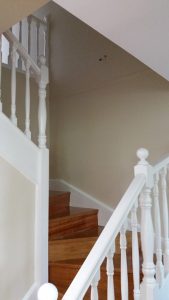
If clients prefer to use oil based enamel gloss for internal woodwork, that’s fine as we’ve used it for years. A well done enamel finish is superb! We don’t often use enamel on walls, but it is especially good for undercoating raw turned wood and giving an even finish on hard knock areas like staircases. .
Paint Colours for Interior Painting
Traditionally to reflect the most light into a room, ceilings and cornices are painted white, or just slightly off white. Pastel or lightly tinted colours are preferred for walls giving the welcome impression of space and light. Mid to deep colours close in a room, making them appear smaller and darker. Many keep it simple and pick a ‘one colour’ scheme for all rooms in the house.
Although people often choose pure white, it is harder to keep clean and may require 3-4 coats. Neutral colours, an off white, beige or cream, is a cheaper and more popular choice for interior wall painting. Often half and quarter strengths of tint of one colour are used to vary the colour between wall and trims, to keep the overall flow and colour scheme neutral and harmonious.
It is only a little more expensive to have different colours (due to more paint wastage), but it’s well worth it for those people who want to have their room’s walls in tints of pink, blue, green, yellow in every shade under the sun .
Contrasting Colour on Woodwork
Woodwork (frames & skirtings) can be the same as the wall or contrast with the wall colour. Feature woodwork such as decorative doors, and especially timber which is naturally stained, make a great traditional contrast choice.
People who like different colours for different rooms are not rare. We often encounter multiple colour choices so that different family members can express their own colour preference by painting ‘their room’, whether it be a bedroom, kitchen, office or lounge in a unique colour.
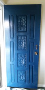
Colour is beautiful. Wood grain patterns, a striking blue on a front door with decorative insertion moulds, these please our eyes and make our homes unique. Be bold!
If you would like to make a strong colour choice, Patrick or Tim can help, please ask. Colour advise is our speciality. If you can’t be totally sure of your own taste, don’t be too shy to ask us. As you can see, we’ve painted homes in a huge variety of colours.
NB. Please note that the original accepted quote price will be varied if more expensive brands of paint are needed or chosen after the quote is accepted. If white, deep base colours, metallic, suede or wallpaper features etc were not quoted… A quote is a quote and extras are extras. We hope you understand.